Madame Clarke’s
Brand Identity
Graphic Design
E-Commerce Photography
Photography
Packaging Design
Interior Design + Styling
Social Media Management
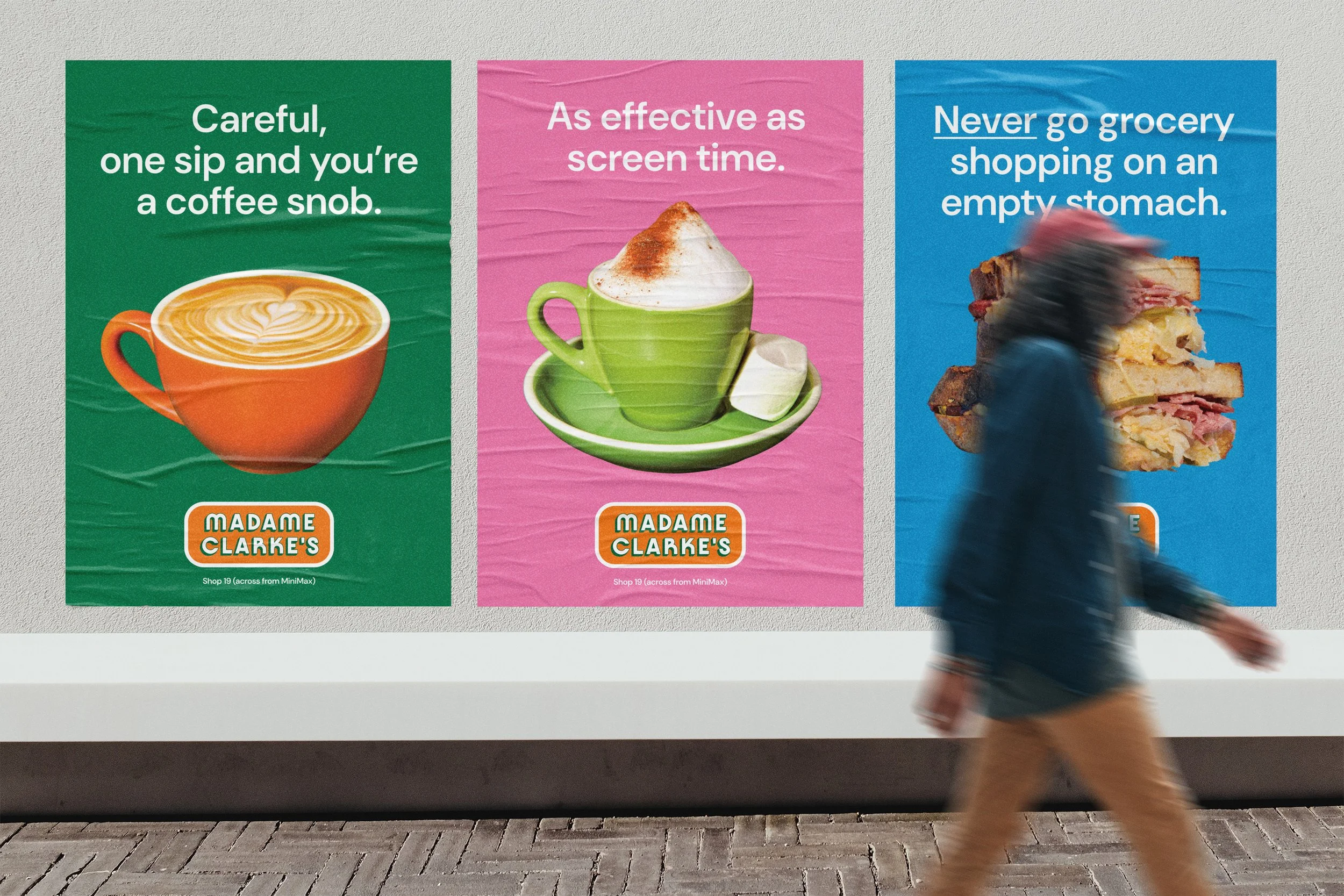
We were tasked with bringing Madame Clarke’s to life with a look and feel that was unique yet paid homage to the cafe’s retro family roots.
The brand identity is comprised of a typeface that is quirky, versatile, and timeless - VJ Type’s ‘Kobe’ (it’s the curved modular structure that we loved); a set of five playful colours - orange, blue, green, yellow, and pink; a retro photography style inspired by vintage Women’s Weekly cookbooks; vintage illustrations inspired by comic books; and a brand voice that is funny yet very matter-of-fact.
We chose a ‘contemporary maximalist’ approach in styling the 200+ sq. meter interior. We knew that the cafe’s menu would offer Australian classic brunch meals done simply and well, so we juxtaposed that simplicity with mismatched retro plates and vintage formica tables and chairs. We brought in over 30 indoor plants to brighten + liven the cafe, which is located in the concrete jungle of a shopping centre.
Our management of the Madame Clarke’s Instagram brings the brand to potential customers’ fingertips with shareable cafe food-related memes alongside our on-brand photography. Our focus on organic content has caught the eyes of Bonds Australia, along with other mainstream brands for collaborations. And we’re just getting started.


